
Daryn AI
Screen design for an AI education service.
Designed the interface
My contribution covers the design of the presented screens and journeys.
The challenge
Make educational tools understandable and accessible.
These screens represent my contribution. Other parts of the live product may have been designed by the wider team.
This case is grounded in the project’s original flows, design versions and UI kit. Open any material at full size. The chapter order explains how decisions connect; interviews or testing are not claimed without supporting source material.
An education service made of connected tools
The supplied file contains games, visual teaching material, presentations, a market and an author workspace. This case covers those presented designs; other parts of the live product may have been created by other team members.
Seven flows before the screen-by-screen detail
The source flows connect selection, setup, action and results. Matching, random selection, fill-in-the-blank and task generation need different transitions. All seven flows from the source page are included below.
True / False↗
Matching↗
Space Race↗
Random Picker↗
Fill in the Blank↗
Detective↗
Task Generator↗
The design system, section by section
The Daryn source UI kit brings together typography, colors, fields, buttons, navigation, cards and spacing. Shared foundations support different games and tools. Filter the library to inspect each part.
Choose a section. Open a board to inspect it at full size.
Inter and type scale
Core and semantic colors
Button sizes and states
Input fields
Navigation
Tags, difficulty and status
Icons
Game cards
Card patterns
Spacing scale
Choose the subject and settings before playing
Subject selection is separate from question count, game mode and additional settings. A step indicator keeps the user oriented without placing the whole setup process on one screen.
Question → feedback → result
The game screen separates teams through color and layout. Answer feedback includes an explanation and score change; the result screen summarizes performance and offers replay or return actions.
The complete journey on a phone
On mobile, teams are stacked vertically and actions have larger touch targets. Setup, questions, feedback and results are shown separately to demonstrate adaptation of the whole journey.
4 screens · Open a preview to inspect the full image. Swipe sideways on mobile →
Shared foundations, different interactions
Matching uses pairs and associations; Space Race links answers to team positions. Shared colors and supporting-information patterns remain consistent while the main interaction changes.
Generation setup and a working editor
Presentation generation starts with a topic, parameters and a visual direction. The editor separates the slide list, canvas and settings. Its mobile version reorganizes them into a vertical workflow.
Find a resource and inspect it
The gallery combines visual-resource cards with search and filters. A detail page prioritizes the image, with specifications and downloading alongside it, followed by related material.
Buyer and author share the same material
The catalog and detail page help buyers choose a resource. The author workspace supports publishing, listing content and reviewing results. This case covers the supplied mockups of those modules.
The public story extends the product language
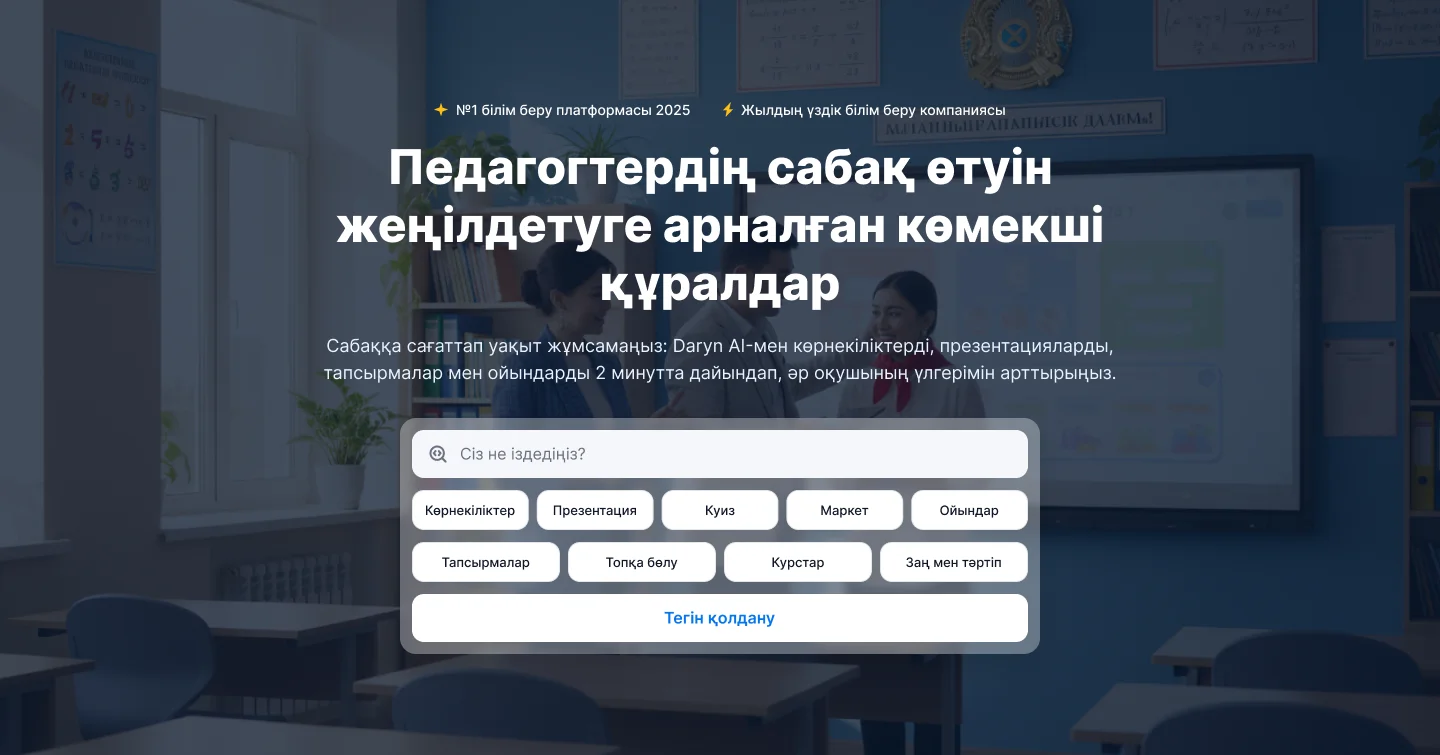
The complete landing design connects the service’s different tools. Its mobile version shows how a long page is reorganized for a narrow screen. These source designs can be opened for detailed inspection.
The project’s character
The outcome
Design of the screens in Figma, including the landing page and service sections. Other live-product pages are outside the stated contribution.