Advin
Interface design for a manufacturing marketplace.
Designed the interface
My contribution covers the design of the presented screens and journeys.
The challenge
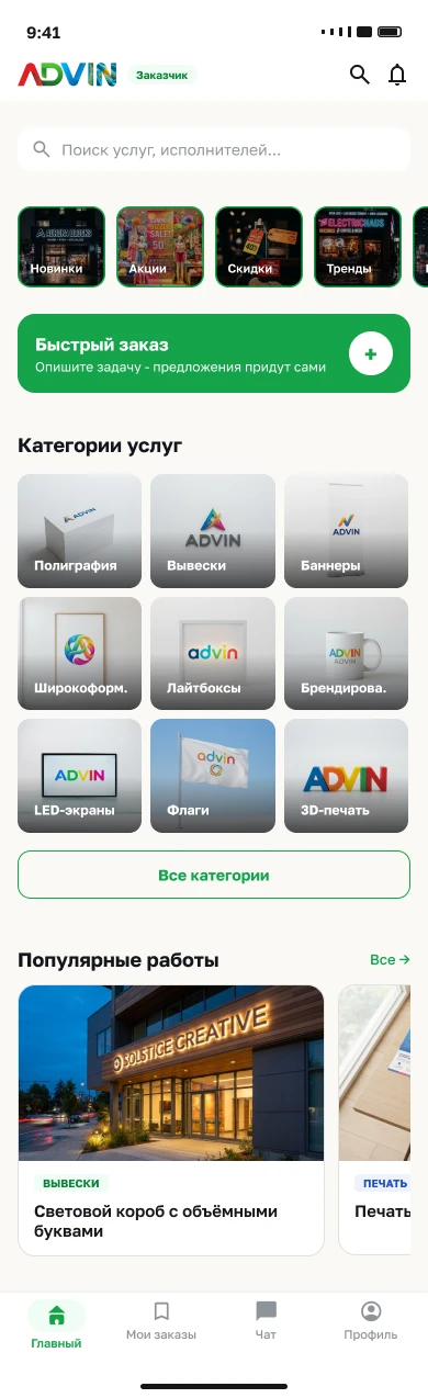
Design a clear interface for discovering services and managing orders.
These screens represent my contribution. Other parts of the live product may have been designed by the wider team.
This case is grounded in the project’s original flows, design versions and UI kit. Open any material at full size. The chapter order explains how decisions connect; interviews or testing are not claimed without supporting source material.
Three roles, different paths through one order
Customers create a brief and choose a proposal. Designers work with the brief, concepts and files. Providers turn approved artwork into production and delivery. Separate flows and interfaces connect these tasks through a shared order.
Customer
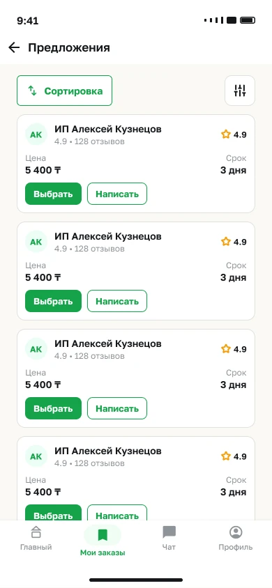
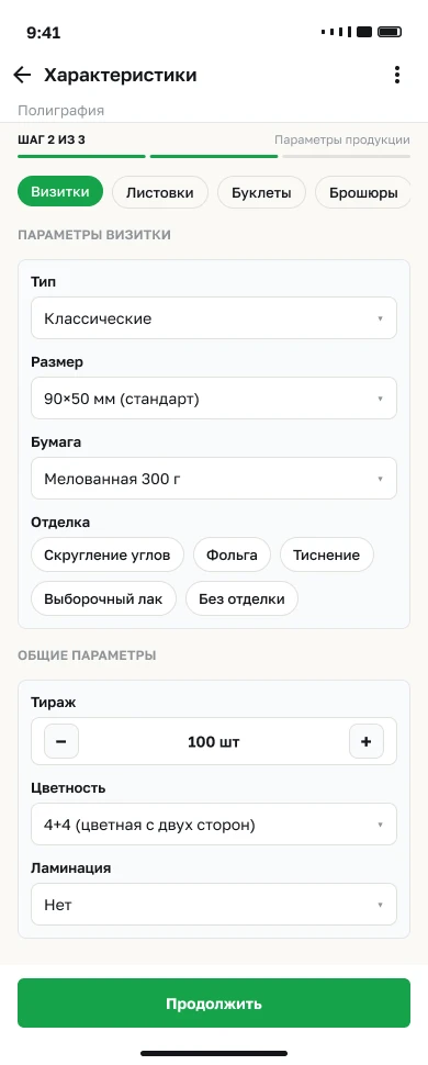
Find a service → configure it → compare proposals
Designer
Choose a brief → propose concepts → hand over files
Provider
Respond → produce → confirm the result
Start with sections and relationships
The source retains current and new customer sitemaps. They show the relationship between catalog, orders, messaging and profile, and allow the versions to be compared before examining individual screens.
Connected journeys across the screens
The flows document actions and decision points for each role: order creation and tracking for customers, briefs and approval for designers, and production and completion for providers. Expand each source flow to inspect it.
Customer journey↗
Designer journey↗
Provider journey↗
Comparing versions in the source file
An exploratory homepage lives on another source page, while the desktop design is on the Design page. The comparison shows different arrangements of catalog, work examples and navigation. These are interface versions, not a claimed A/B-test result.
The design system, section by section
The Advin source UI kit defines role colors, a Golos Text scale, buttons, inputs, cards, badges and navigation. The original boards and 20 source SVG icons connect three role-specific workspaces.
Choose a section. Open a board to inspect it at full size.
Colors for three roles
Golos Text and type scale
Buttons and states
Fields and validation
Chips and tags
Badges and statuses
Cards for different entities
Navigation
Progress, messages and states
Original SVG icons / 20 examples


From finding a service to tracking the order
The journey starts with service discovery and product parameters, then moves through artwork preparation, brief review and proposals. Messaging and order states continue after a provider is chosen.
Briefs, concepts and handover
Designers have a brief feed and detailed requirements. Concepts carry approval states, and file transfer is a separate step with deliverable requirements. The design covers approval and handover as well as discovery.
4 screens · Open a preview to inspect the full image. Swipe sideways on mobile →
Production has its own interface
Providers respond to orders, manage production, document results with photographs and arrange delivery. The content changes at each step while the order and role context remain consistent.
4 screens · Open a preview to inspect the full image. Swipe sideways on mobile →
The same tasks on a larger screen
Desktop layouts redistribute space into persistent navigation, a working area and supporting information. The following show customer discovery, designer concepts and provider production.
Response, rejection, progress and completion
The project includes a rejected response, file-delivery requirements and in-progress and completed orders. Badges, messages, indicators and control variants in the UI kit support these distinctions.
The project’s character
The outcome
Mobile screens, navigation and interaction flows. My contribution is the screen design in the linked Figma file.