
Nymantec
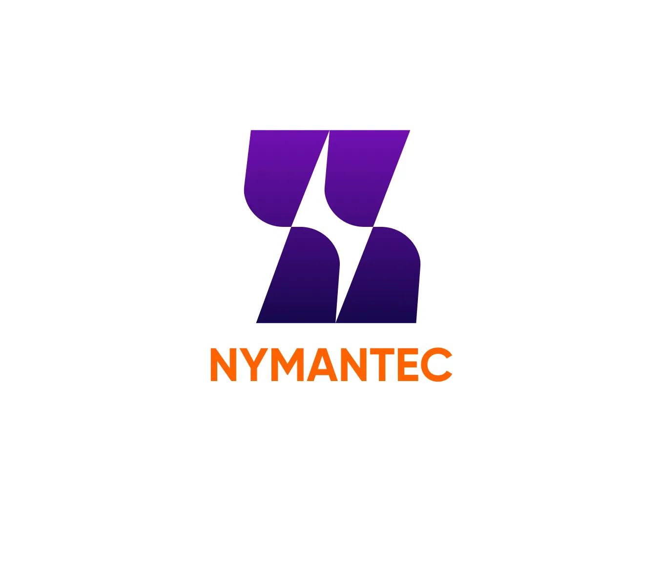
Logo for a cable company — letter 'N' formed from power cables with a lightning bolt in negative space
The challenge
The cable company needed a logo that immediately reads as an electrical engineering brand — professional, technological, and memorable.
The symbol needed to speak about the industry without resorting to clichéd symbols of a plug or socket.
An initial, cable and energy
The cable-company mark is built around the letter N. Four substantial forms suggest cable flows, while the white gap between them creates a lightning bolt. The idea is carried by both shape and negative space.
01The letter N
The slant and parallel forms combine into a recognizable initial.
02A bolt at the center
The white gap is an active part of the mark.
03A two-color contrast
The purple symbol and orange name distinguish mark and word.
A cool mark and a warm accent
The purple gradient gives the mark depth, while the orange wordmark supports the energy association. A light field keeps the silhouette and negative space clear. The symbol, color relationship and wordmark proportions carry through to applications.
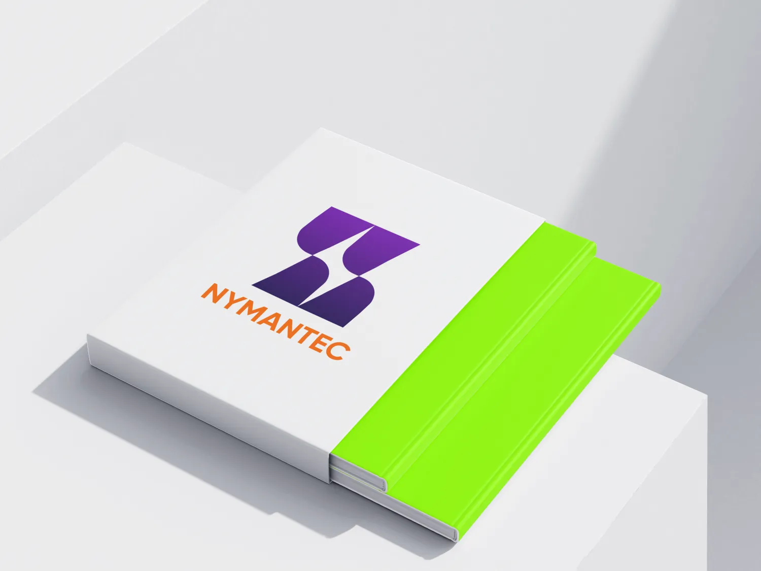
The mark on physical objects
The print-application mockup shows the mark and wordmark on a light surface. It presents an identity application rather than evidence of a production run.
The project’s character
The outcome
The logo works on two levels of perception: at first glance, the letter 'N' is read; upon closer examination — a lightning bolt.
The negative space effect makes the symbol intellectually interesting and memorable — exactly what a brand in a competitive niche needs.